
 |
| Carolina's Current Jerseys (est. 2008) |
I might get in trouble for this one. The Carolina Hurricanes were established out of the remains of the beloved Hartford Whalers in 1997. Every hockey fan outside of the Carolinas has a soft spot in their heart for The Whalers. Even though the Hurricanes won their first cup while being in the league for only eight years, everyone wants the Hartford Whalers back. Well, sorry everyone, but The Whalers are dead. Raleigh is a hockey town and it's time to get over it!
The Color Scheme: Navy Blue, Light Blue, Red & White.
With all of that being said, I actually did not base this new Carolina color scheme off of The Whalers blue, green and white palate. The blues and white were for a whole different reason.
 |
| Debut Jersey (est. 1997) |
What's wrong with the current red, black, white & silver scheme, you ask? Pretty much everything. The red does make sense in the fact that the flag warning system for indicating horrible weather conditions is red, but I'm not liking it. When I think hurricane, I think water and wind. Who first thinks of a red flag? Possibly people much smarter than I.
Anyways, I started this redesign with shades of red, mixed with shades of blue. The result was interesting, but not very cohesive. As I started thinking about water, I thought that blues and white would remind the viewer of a violent Atlantic Ocean with foamy waves crashing against the shore.
Anyways, I started this redesign with shades of red, mixed with shades of blue. The result was interesting, but not very cohesive. As I started thinking about water, I thought that blues and white would remind the viewer of a violent Atlantic Ocean with foamy waves crashing against the shore.
The Branding: Primary 'Canes' Logo, Secondary 'Hurricane' Logo & 'Flag' Logo.
 |
| 305cHL Carolina Hurricanes Logo Set |
 |
| I Assume there's a lot of Suck-tion... |
I believe it was when The Boston Bruins played The Hurricanes in the playoffs one year that I stumbled upon the hurricane toilet. I actually kind of liked The Hurricane logo until I saw this photo. Once you see something like that, you can't un-see it. So, I knew I had to do something drastic for The 305cHL Hurricanes.
The primary logo is a mix of the Canes word mark and the swirling hurricane logo. I like the combination because you get a real sense of movement and you discourage the toilet logo.
Again, more trouble for me and my thought process on the secondary logos. One of the secondary logos is the aforementioned, toilet logo. I thought that it would be a nice shoulder patch and if it was in a secondary, smaller role, it would be okay to use.
Again, more trouble for me and my thought process on the secondary logos. One of the secondary logos is the aforementioned, toilet logo. I thought that it would be a nice shoulder patch and if it was in a secondary, smaller role, it would be okay to use.
Home & Away Jerseys: Home Primarily Navy Blue, Away Primarily White.
 |
| Making Japanese Epilepsy Robots Seem Tame Since 2008 |
This was a tough jersey to do because I took little, to no inspiration from The Carolina Hurricanes jersey. The striping doesn't look good to me, and I really don't like those small hurricane flags around the bottom of the jersey. What I did take from them was the shoulder patches from the current third jersey, and the overall size of the striping at the bottom of the jersey. That's it. Everything else was loosely (very loosely) based off from the Hartford Whalers.
Take a peak at the 1992 Hartford Whalers jersey, look familiar? Well, it shouldn't look too familiar, but I slightly based The 305cHL jersey off of the '92 Whalers. Hartford wore these jerseys up until they turned into The Carolina Hurricanes, so this is a good place to start the re-design. I dumped the silver outline and stuck with the three stripe design. I added the Carolina third jersey shoulder patches, splashed on the color scheme and, viola, a jersey that Carolina can be proud to wear.
Take a peak at the 1992 Hartford Whalers jersey, look familiar? Well, it shouldn't look too familiar, but I slightly based The 305cHL jersey off of the '92 Whalers. Hartford wore these jerseys up until they turned into The Carolina Hurricanes, so this is a good place to start the re-design. I dumped the silver outline and stuck with the three stripe design. I added the Carolina third jersey shoulder patches, splashed on the color scheme and, viola, a jersey that Carolina can be proud to wear.
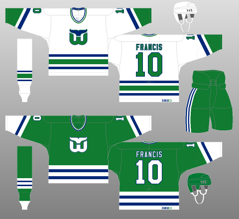 |
1985 Hartford Whalers
What a Beauty
|
Sorry Carolina, but you have to embrace your killing of the Hartford Whalers. The alternate jersey of The 305cHL Carolina Hurricanes pays tribute to it's fallen brother. The inspiration came from the 1985 Whalers jersey. With slight modifications to the sleeves and bottom of the jersey, it is unique enough to call their own, but has strong ties to the original franchise.
Summary:
Even though I talked more about The Whalers than The Canes, I believe this is a strong jersey set that Carolina would be proud to wear. It really does remind you of a storm, and after all, isn't that what this whole thing is about?
Final thought: With all the love for The Whalers, look at how horrible their initial logo was:
 |
| I prefer the toilet logo... |
Images of jerseys from Chris Creamer's Sports Logos & The Hockey Uniform Database.
Jersey Template from Icethetics.
No comments:
Post a Comment